
Ever tried to figure out how long it takes your customers to pay their invoices?
At first, this sounds pretty straightforward. Take the invoices that have been paid, calculate the number of days between the invoice date and payment date, and find the average.
But what about the invoices that haven’t been paid yet?
You don’t know their final payment time, so you can’t calculate days to payment. Ignoring them isn’t a great answer either, because those open invoices may include some of the slowest-paying customers in the dataset.
This is exactly the kind of problem survival analysis is designed to handle.
The name makes it sound like something that belongs strictly in medicine, but the basic idea is much broader. Survival analysis looks at how long it takes for an event to happen, especially when that event hasn’t happened yet for everyone in the dataset.
That event could be:
- a customer cancelling a subscription,
- an employee leaving,
- a machine failing,
- a loan defaulting, or
- an invoice getting paid.
In this post, we’ll use Python in Excel to analyze that last example.
Understanding the data
The workbook contains a table named Invoices with 400 simulated accounts receivable records. Each row represents one invoice and includes fields such as invoice amount, customer segment, payment terms, issue date, and payment date.
For this analysis, two columns are especially important: days_observed and paid.
If an invoice has been paid, days_observed tells us how many days it took to receive payment, and paid equals 1. If an invoice is still open, days_observed tells us how many days have passed since the invoice was issued, and paid equals 0.
That second situation is what survival analysis calls censoring. The term sounds more complicated than the idea.
Suppose an invoice has been outstanding for 40 days when we run the report. We don’t know whether it will eventually be paid on day 45, day 80, or day 150, but we do know something useful: it has already remained unpaid for at least 40 days.
Survival analysis lets us use that information instead of throwing the invoice away.
Bringing the data into Python
Let’s start by bringing the Excel table into a pandas DataFrame.
import statsmodels.api as sm

invoices_df = xl("Invoices[#All]", headers=True)

invoices_df.head()
The xl() function brings the Excel table directly into Python, while headers=True tells Python to use the first row of the table as the column names.
For the survival analysis, we’ll use statsmodels, one of the statistical libraries available in Python in Excel. That means we can run the analysis directly inside the workbook.
Building the survival curve
Now we can estimate what is called a survival curve, which in this example simply shows the proportion of invoices that are still unpaid after a given number of days.
The idea is straightforward: as time passes, what share of invoices remains unpaid?
Use the following code:
payment_survival = sm.SurvfuncRight(
    invoices_df["days_observed"],
    invoices_df["paid"]
)

payment_survival.summary().head()

SurvfuncRight() needs two pieces of information. days_observed tells it how long we observed each invoice, while paid tells it whether payment actually occurred during that period.
The resulting table gives us a look under the hood of the survival curve. Each row represents a point when one or more payments occurred.
For example, at day 5 there are 400 invoices at risk, one payment occurs, and the estimated probability of an invoice remaining unpaid falls to 99.75%.
The num at risk column tells us how many invoices are still contributing information immediately before each payment time. That number can fall because invoices get paid or because an observation becomes censored. num events tells us how many payments occurred at that point.
Surv prob is the estimated probability that an invoice remains unpaid, while Surv prob SE is the standard error associated with that estimate.
This type of calculation is commonly called a Kaplan-Meier estimate. You’ll see that term in statistics books and software documentation, but the business interpretation is much simpler: we’re estimating how the unpaid population changes over time while still making use of open invoices.
Plotting the results
A survival curve becomes much easier to understand once you see it, so let’s plot the estimate.
fig, ax = plt.subplots()

ax.step(
    np.r_[0, payment_survival.surv_times],
    np.r_[1, payment_survival.surv_prob],
    where="post"
)

ax.set_xlabel("Days since invoice")
ax.set_ylabel("Probability invoice remains unpaid")
ax.set_title("Invoice payment survival curve")
ax.set_ylim(0, 1)

fig

The curve starts at 100% because every invoice is unpaid when it is first issued. From there, it steps downward as payments occur.
Rather than estimating values by eye from the chart, we can also pull the survival probability at specific points in time.
def survival_at_day(survival, day):
    index = np.searchsorted(
        survival.surv_times,
        day,
        side="right"
    ) - 1

    if index < 0:
        return 1.0

    return survival.surv_prob[index]


check_days = [30, 45, 60]

pd.DataFrame({
    "days_since_invoice": check_days,
    "probability_unpaid": [
        survival_at_day(payment_survival, day)
        for day in check_days
    ]
})

In this simulated dataset, about 84% of invoices are still unpaid after 30 days. By 45 days that falls to roughly 57%, and by 60 days only about 27% remain unpaid.
That gives us a richer picture of accounts receivable than a single average. We can ask what percentage of invoices are likely to remain open after 30, 45, or 60 days, see how quickly the unpaid population declines, and identify the point by which most invoices have been paid.
Finding the median payment time
Another useful summary is the median payment time, which is the point where the estimated survival probability reaches 50%.
We can get that directly from the survival model:
median_payment_days = payment_survival.quantile(0.5)

median_payment_days
For this dataset, the result is 49 days.
In other words, the estimated median time to payment is 49 days. Unlike an average calculated only from completed payments, this estimate also makes use of the information contained in invoices that were still open when the data was collected.
Comparing customer segments
The overall payment curve is useful, but finance teams are often interested in whether different groups behave differently.
For example, do Enterprise customers tend to pay sooner than Small Business customers?
We can build a separate survival curve for each customer segment:
fig, ax = plt.subplots()

for segment, group in invoices_df.groupby("customer_segment"):

    segment_survival = sm.SurvfuncRight(
        group["days_observed"],
        group["paid"]
    )

    ax.step(
        np.r_[0, segment_survival.surv_times],
        np.r_[1, segment_survival.surv_prob],
        where="post",
        label=segment
    )

ax.set_xlabel("Days since invoice")
ax.set_ylabel("Probability invoice remains unpaid")
ax.set_title("Invoice payment patterns by customer segment")
ax.set_ylim(0, 1)
ax.legend()

fig
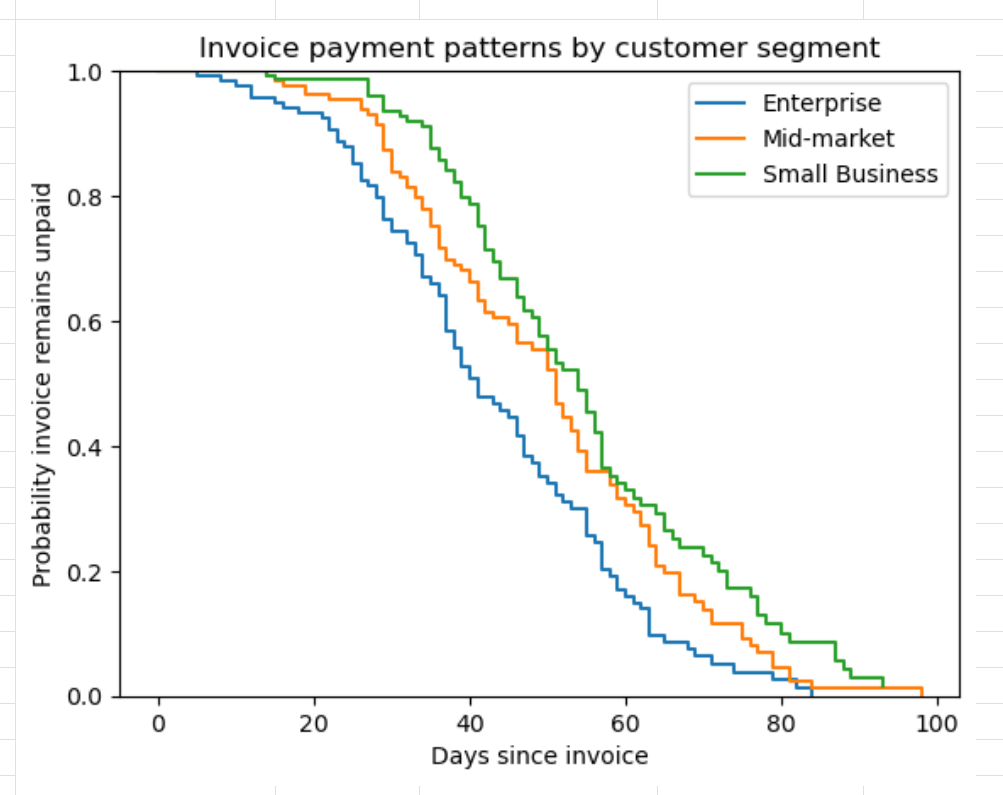
Each line now represents the estimated probability that an invoice from that segment remains unpaid as time passes.
A curve that stays higher indicates that invoices in that group tend to remain open longer. In our simulated data, the Small Business curve stays above the Enterprise curve for much of the period.
At around 45 days, roughly 45% of Enterprise invoices remain unpaid, compared with about 67% of Small Business invoices.
We can also summarize each segment with its estimated median payment time:
segment_medians = []

for segment, group in invoices_df.groupby("customer_segment"):

    segment_survival = sm.SurvfuncRight(
        group["days_observed"],
        group["paid"]
    )

    segment_medians.append({
        "customer_segment": segment,
        "median_payment_days": segment_survival.quantile(0.5)
    })

pd.DataFrame(segment_medians)

That gives us a compact numerical comparison to go along with the chart.
Because this is simulated data, there is no real-world conclusion to draw from the particular differences between Enterprise, Mid-market, and Small Business customers. The point is the analytical workflow.
With real accounts receivable data, the same approach could help identify customer groups with meaningfully different payment patterns.
Why not just calculate average days to pay?
You certainly can, and for many reporting purposes you probably should.
The problem is that a conventional average usually includes only invoices that have already been paid.
Imagine that some of your slowest-paying customers currently have a large number of invoices sitting open. If those invoices haven’t reached their eventual payment dates yet, they disappear from an average based only on completed payments, potentially making payment performance look better than it really is.
Survival analysis handles those unfinished observations differently.
An invoice that has been open for 70 days still tells us something: it has remained unpaid for at least 70 days. We don’t pretend to know when it will eventually be paid, but we don’t throw away the information we already have either.
Why this is a useful Python in Excel example
This is also a good example of where Python in Excel earns its keep.
Excel already handles an enormous amount of everyday financial analysis well. There isn’t much reason to reach for Python just to calculate a sum or reproduce something a PivotTable can already do easily.
Survival analysis is different. Excel’s built-in tools get pretty thin once you start working with censored time-to-event data.
With a relatively small amount of Python code, we can keep our accounts receivable data in the workbook while using a statistical technique that would be awkward to reproduce with regular worksheet formulas.
Once you get past the slightly dramatic name, the business question is actually pretty intuitive:
How long does it take for something to happen, and what can we learn from the cases where it hasn’t happened yet?
That question turns up in finance, operations, customer analytics, HR, and plenty of other areas.
Where to go next
We’ve kept this example pretty simple. The data is simulated, we’re looking at one payment event per invoice, and we’re mainly using the survival curve as a descriptive tool.
Real accounts receivable data can get messier quickly. You might have partial payments, disputed invoices, write-offs, customers with many invoices, or major differences in behavior based on invoice size, payment terms, industry, or other factors.
There are statistical questions we haven’t tackled here either.
For example, you may want to test whether two survival curves are actually different instead of simply eyeballing the chart. statsmodels includes tools for comparing survival distributions, including the log-rank test.
You can also move beyond describing payment patterns and start asking what factors are associated with faster or slower payment.
One common next step is Cox proportional hazards regression. That lets you examine several variables at once, such as invoice size, payment terms, and customer segment, while still accounting for invoices that haven’t been paid yet.
There are assumptions behind these models too, so more advanced does not automatically mean more useful. With real data, you’d want to spend some time checking whether the model makes sense for the business process you’re analyzing.
Another limitation is that the survival tools we’re using in statsmodels are mainly designed around right-censored data, which is exactly what we have here: we know an invoice has remained unpaid up to a certain date, but we don’t yet know when payment will eventually occur.
If you want to keep exploring, the statsmodels survival analysis documentation is a good next stop.
And if you eventually move outside Python in Excel and want to get deeper into survival analysis as a machine learning problem, scikit-survival is worth a look.
For now, the main takeaway is much simpler: survival analysis gives us a way to study time-to-event questions without pretending unfinished observations don’t exist.
Learn more Python in Excel
If this kind of analysis is interesting to you, my forthcoming book Python in Excel for Data Analytics goes much further into using Python to extend what you can do inside Excel.
It’s written for Excel users who want to work with tools like pandas, visualization, statistical analysis, forecasting, and simulation without turning the whole exercise into a computer science course.
You can learn more and pre-order the book here: