
A run rate can be as simple as taking the latest month and multiplying it by 12. That simplicity is also exactly why run rates can be misleading.
If August is normally a soft month, annualizing August can make the business look weaker than it really is. A three-month average may smooth things out, but it can still be distorted by quarter-end billing. A seasonality-adjusted approach sounds more sophisticated, but it only helps if the seasonal pattern is stable enough to trust.
Rather than arguing over which shortcut is “best,” we can do something more useful: replay several run-rate methods against prior years and see how they actually performed.
That is where Python in Excel becomes useful. Excel and Power Query can calculate any one of these methods perfectly well. Python earns its keep when we want to apply several definitions consistently, backtest them across prior periods, calculate the errors, and visualize the results in one repeatable workflow.
The exercise workbook contains more than 5,000 transaction-level revenue records beginning in 2022. The business has a recognizable seasonal pattern: summer tends to be softer, quarter ends can be stronger, and year-end revenue can be significant.
Imagine that we are sitting at August 31 and management wants a full-year revenue run rate. We will compare four reasonable approaches:
- 1-Month Run Rate: August revenue multiplied by 12.
- 3-Month Run Rate: the June-August monthly average multiplied by 12.
- YTD Annualized: the January-August monthly average multiplied by 12.
- Seasonal Build: January-August actual revenue divided by the historical share of annual revenue normally earned through August.
Then we will ask the more important question: if we had used each method at August 31 in 2023, 2024, and 2025, how close would it have come to the actual full-year result?
Load and summarize the transaction data
Start by loading the Excel table into Python and making sure the transaction date is treated as a proper date:
tx = xl("tbl_transactions[#All]", headers=True)

tx["TransactionDate"] = pd.to_datetime(
    tx["TransactionDate"]
)

tx.head()
The first rendered output is a useful validation step, not just decoration. We can see the transaction date, customer, and amount coming through as expected. In the five rows shown, the sample transactions are all dated January 3, 2022, and range from roughly $5,600 to $12,300. Before building any annualization logic, this confirms that Python is reading the Excel table correctly and that the amount field is behaving like a numeric measure.
Next, roll the transaction-level data up to monthly revenue. We also add the calendar year and month number because both become useful later in the analysis:
monthly = (
    tx.assign(
        Month=tx["TransactionDate"]
        .dt.to_period("M")
        .dt.to_timestamp(),
        Year=tx["TransactionDate"].dt.year,
        MonthNum=tx["TransactionDate"].dt.month
    )
    .groupby(
        ["Month", "Year", "MonthNum"],
        as_index=False
    )["Amount"]
    .sum()
    .sort_values("Month")
)

monthly.head(12)
The monthly output immediately reveals why a simple monthly run rate can be dangerous. In 2022, August revenue is only about $780,000, while December is just over $2.0 million. June and September are also noticeably stronger at about $1.17 million each. The point is visible before we calculate anything fancy: these months are not interchangeable.
First, understand the seasonal shape
Before comparing run-rate methods, it helps to see how revenue is distributed throughout a typical year. For each complete historical year, calculate each month’s share of annual revenue and then average those monthly shares:
history = monthly[
    monthly["Year"] < 2026
].copy()

annual_totals = (
    history
    .groupby("Year")["Amount"]
    .transform("sum")
)

history["MonthShare"] = (
    history["Amount"]
    / annual_totals
)

seasonality = (
    history
    .groupby("MonthNum")["MonthShare"]
    .mean()
    .to_frame("Average Share")
)

seasonality
The table makes the seasonal assumption explicit. Across the historical years, August contributes only about 6.5% of annual revenue on average, compared with roughly 13.7% in December. January through August together account for about 60.8% of annual revenue. That 60.8% figure is the kind of historical relationship a seasonal build tries to exploit.
A chart makes the shape easier to absorb:
seasonality_plot = (
    seasonality
    .reset_index()
)

seasonality_plot["Month"] = pd.to_datetime(
    seasonality_plot["MonthNum"],
    format="%m"
).dt.strftime("%b")

fig, ax = plt.subplots()

(
    seasonality_plot
    .set_index("Month")["Average Share"]
    .mul(100)
    .plot.bar(ax=ax)
)

ax.set_title(
    "Historical Share of Annual Revenue by Month"
)
ax.set_xlabel("")
ax.set_ylabel("Average Share of Annual Revenue (%)")

fig
The chart makes the problem with August-times-12 especially obvious. A perfectly even year would put each month at about 8.3% of annual revenue. August in this history is closer to 6.5%, while December is nearly 13.7%. Annualizing August as though it were a typical month therefore builds a downward bias into the estimate.
That still does not prove that the seasonal build is always the right answer. It assumes that the historical shape remains useful. The backtest is where we get to test that assumption instead of simply admiring the December bar.
Build the four August run-rate methods
The main function takes a year and calculates all four estimates as of the end of August:
def august_estimates(year):

    prior = monthly[
        monthly["Year"] < year
    ].copy()

    full_years = (
        prior
        .groupby("Year")["MonthNum"]
        .nunique()
    )

    full_years = full_years[
        full_years == 12
    ].index

    prior = prior[
        prior["Year"].isin(full_years)
    ]

    annual_by_year = (
        prior
        .groupby("Year")["Amount"]
        .sum()
    )

    jan_aug_by_year = (
        prior[
            prior["MonthNum"] <= 8
        ]
        .groupby("Year")["Amount"]
        .sum()
    )

    historical_aug_share = (
        jan_aug_by_year
        / annual_by_year
    ).mean()

    current = monthly[
        (monthly["Year"] == year)
        & (monthly["MonthNum"] <= 8)
    ].sort_values("Month")

    ytd = current["Amount"].sum()

    return {
        "1-Month Run Rate":
            current["Amount"].iloc[-1] * 12,

        "3-Month Run Rate":
            current["Amount"].tail(3).mean() * 12,

        "YTD Annualized":
            ytd / 8 * 12,

        "Seasonal Build":
            ytd / historical_aug_share
    }
The first three methods are straightforward annualizations. The seasonal build calculates what percentage of full-year revenue had historically been earned by the end of August, then divides the current year’s January-August actual revenue by that percentage.
There is also an important control in the function: the seasonal calculation only uses complete years before the year being tested. When we test 2024, the function cannot use 2024 itself to define the seasonal pattern. That keeps the backtest from quietly looking into the future.
Put the historical estimates side by side
Because the function returns a dictionary of method names and estimates, pandas can build a compact comparison table directly:
estimates_table = pd.DataFrame({
    2023: august_estimates(2023),
    2024: august_estimates(2024),
    2025: august_estimates(2025)
})

estimates_table
The output is more informative than a generic “methods by year” table suggests. In 2023 the estimates range from about $9.8 million for the one-month run rate to $13.6 million for the seasonal build. In 2024 they range from about $11.4 million to $15.0 million. By 2025, the three-month run rate and YTD annualized methods are clustered around $15.3-$15.6 million, while the seasonal build jumps to about $17.2 million.
That widening 2025 seasonal estimate is an early warning. The method is assuming that a relatively small share of the year is normally earned by August, but the business has started pulling more revenue forward. We have not calculated the errors yet, but the output already hints that the old seasonal pattern may be losing relevance.
Backtest the methods against what actually happened
Now calculate the actual full-year revenue for 2023 through 2025 and compare each August estimate with the eventual result. We will use absolute percentage error, or APE:
APE = |Estimate - Actual| / Actual
Lower is better. Because our estimates and actuals are already aligned by year, pandas can calculate the entire error matrix without building a long intermediate backtest table:
actual_by_year = (
    monthly[
        monthly["Year"].isin([2023, 2024, 2025])
    ]
    .groupby("Year")["Amount"]
    .sum()
)

actual_by_year

error_plot = (
    estimates_table
    .sub(actual_by_year, axis="columns")
    .abs()
    .div(actual_by_year, axis="columns")
    .mul(100)
)

error_plot
Now visualize those errors:
fig, ax = plt.subplots()

error_plot.plot.barh(ax=ax)

ax.set_title(
    "How Accurate Was Each Method?"
)
ax.set_xlabel(
    "Absolute Percentage Error (%)"
)
ax.set_ylabel("")

fig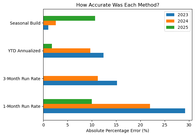
In 2023, the one-month run rate is off by about 29.2%. The three-month version gets that down to 15.2%, and YTD annualized comes in at 12.4%. The seasonal build is almost dead on, missing by only about 1.0%.
2024 tells pretty much the same story. The one-month run rate is still way off at about 22.0%, while the seasonal build misses by only about 2.6%. At that point, you might be tempted to declare seasonality the winner and move on.
Then 2025 shows up and ruins that conclusion.
The three-month run rate lands almost exactly on the actual $15.55 million result. YTD annualized is also very close, at about 1.75% off. Meanwhile, the seasonal build misses by about 10.6%.
So the historical pattern that worked beautifully in 2023 and 2024 is suddenly a lot less useful.
That is really the point of the backtest: you are trying to find out which assumptions have actually held up in your data, and whether they still seem reasonable now.
Summarize the historical error
We can also average the error across the three backtest years to get a simple method-level scorecard:
accuracy = (
    error_plot
    .mean(axis=1)
    .sort_values()
    .to_frame("Mean Error %")
)

accuracy
And plot the result:
fig, ax = plt.subplots()

accuracy[
    "Mean Error %"
].plot.barh(ax=ax)

ax.set_title(
    "Historical Error by Run-Rate Method"
)
ax.set_xlabel(
    "Mean Absolute Percentage Error (%)"
)
ax.set_ylabel("")

fig
On average, the seasonal build still comes out best at about 4.7% error. YTD annualized is next at roughly 8.0%, followed closely by the three-month run rate at 8.8%. The one-month run rate is a distant last at about 20.4%.
But the average should be read alongside the year-by-year chart, not instead of it. A 4.7% mean error sounds decisive until you remember that the same seasonal method missed by more than 10% in 2025. The summary tells us which method performed best overall; the detailed backtest tells us how fragile that conclusion may be.
Where Python in Excel actually adds value
None of the individual formulas in this analysis requires Python. Excel can annualize a month, Power Query can aggregate transactions, and PivotTable can summarize historical revenue.
The stronger argument for Python is the analytical loop around those calculations: build several methods from the same monthly series, constrain the historical information available to each backtest year, compare estimates with eventual outcomes, calculate the error matrix, summarize it, and visualize the results.
In other words, the scope of analysis shifts from “what is our run rate?” from “How has this run-rate definition actually behaved when we would have used it in the past?”
That is a much more thorough conversation to have before putting a run-rate number into a management deck.
All that said, this is still a small historical sample, and a backtest cannot guarantee that the best-performing shortcut will remain the best-performing shortcut. Structural changes, acquisitions, pricing changes, customer mix, product launches, and unusual contracts can all change the revenue pattern.
That is why I would treat this analysis as evidence for management judgment rather than a forecasting model. The goal is to make the assumptions behind a run rate more visible and to test whether those assumptions have held up before.
If you want to see the basics of Python in Excel for data analysis, check out my forthcoming book Python in Excel for Data Analytics.
Teach your team to extend Excel analysis with Python
I lead hands-on Python in Excel workshops for analysts. We can scope a one- or two-day session around the skills your team needs for reporting, visualization, and analysis.
Organizing training through L&D? Tell me about your group and preferred timing.