We’ve probably all heard by now that data professionals spend 80% of their time cleaning data. But why? It’s true that in data analysis, some assembly is required — whether to meet the assumptions of a given model or for the sake of presentation, different shapes and formats might work better in different situations.
But, as the saying goes, the best cure is prevention: much of this lengthy data preparation could be avoided with better data collection and storage methods in the first place. Tidy data makes for easier analysis — even when that tidy data looks complicated to the human eye. Let’s take an example using a real-world wholesale customers dataset from the UC Irvine Machine Learning repository.
Aggregating the data… what’s wrong?
As a first step to analyzing this data, let’s pull total sales by region. PivotTables are a great choice for aggregating the data, so let’s give it a try.
As it turns out, the way this data is stored makes it tricky to work with PivotTables. Ideally, there would be a single sales column that we could take the average of. Instead, there are multiple fields for each department:

One solution to this problem might be simply to sum up columns C through D and then operate on that total. This serves as a temporary fix, but it doesn’t get rid of the department-level fields cluttering our PivotTable menu.

Moreover, what if we wanted to enhance this dataset to include things like units sold, profitablity, and so forth? Storing each by department along the columns would get extremely difficult and hard to work with in a PivotTable. You may have seen such a report in the past yourself.
The reason this and many other datasets get difficult to analyze is that they are just not stored in a format that is conducive to analysis. The rules of “tidy data” offer a solution.
The rules of “tidy data”
In 2014 Hadley Wickham of R fame wrote an article in the Journal of Statistical Software called “Tidy Data.” As Wickham stated in the article’s abstract:
A huge amount of effort is spent cleaning data to get it ready for analysis, but there has been little research on how to make data cleaning as easy and effective as possible.
Wickham proposed three rules of “tidy data” to guide how data should be stored for analysis:
- Each variable forms a column.
- Each observation forms a row.
- Each type of observational unit forms a table.
In my experience, most “tidy transgressions” are a result of not following the first rule, which may be the easiest to understand. So let’s confim that each variable does indeed form a column.
One way to confirm this is to take another look at the columns of the dataset — do they all follow different units of measurement? If not, then you may have a variable stored in multiple columns rather than one.
Sales is a variable, category another
Remember how our PivotTable just seemed too cluttered, like there were too many columns? It was onto something: the six columns in C through H should really just be two: Category and Sales.

Think about it — all these cells represent the same measure, Sales, across different dimensions, Category. With one variable across many columns, things become a nightmare to analyze. Adding a “Total sales” column like before is an OK temporary fix. But for a real solution, we’re going to need to “tidy” this data.
Data tidying with Power Query
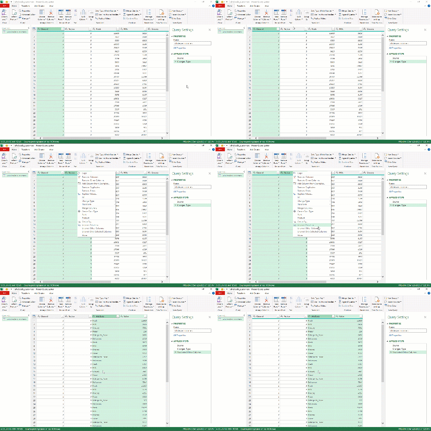
Fortunately, Power Query makes this data reshaping a breeze. After you’ve loaded wholesale_customers into Power Query, press Ctrl and select Region along with Channel, then right-click and seelct “Unpivot Other Columns:”

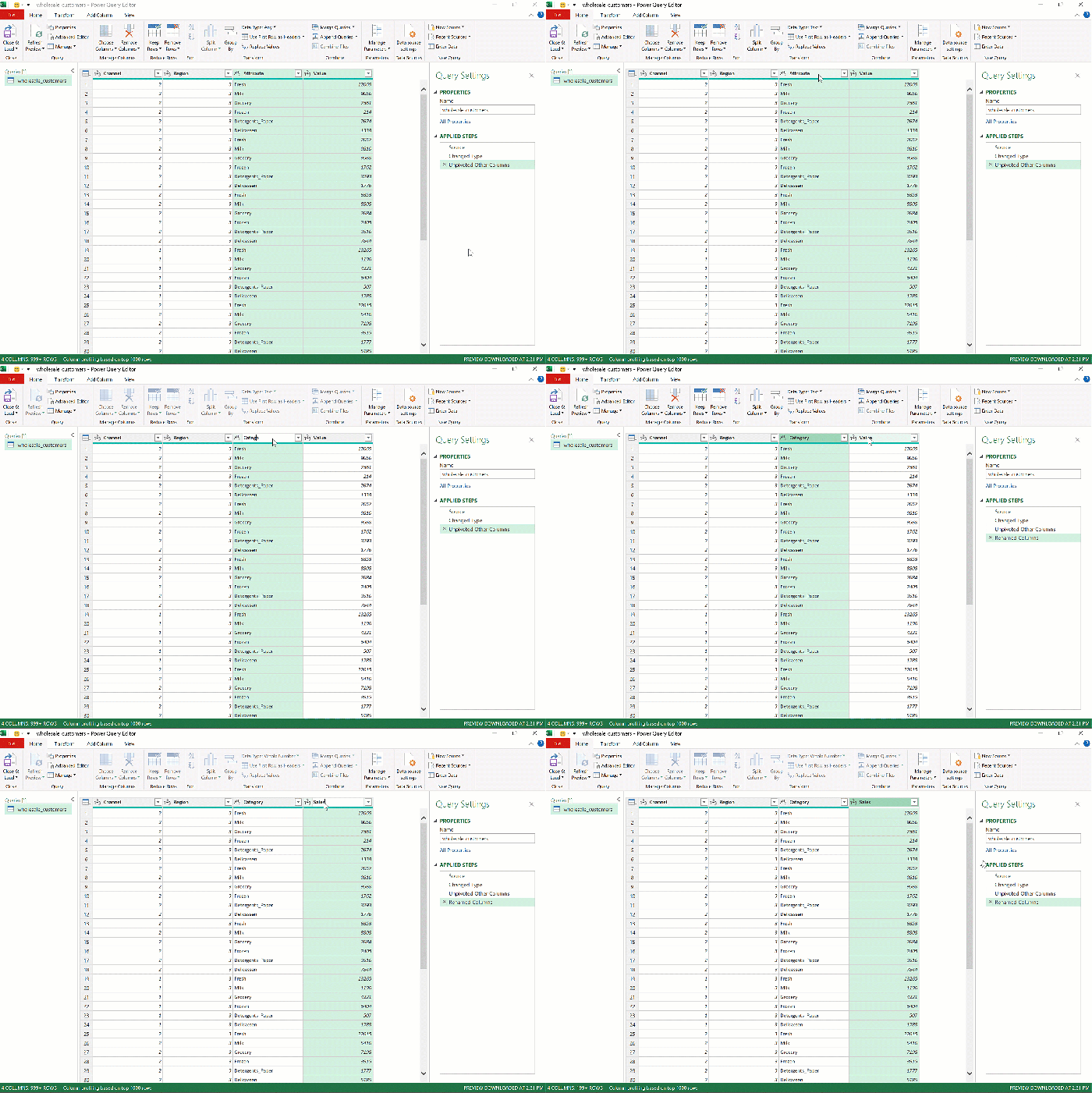
Presto! As we envisioned, the six sales columns became two, which you can rename by double-clicking on the headers to Category and Sales.

Finally, click Close & Load on the ribbon to load this tidied data into Excel.
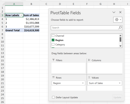
Just to confirm that the reshaped data meets our needs, go ahead and insert a PivotTable from it. Look how much cleaner it is to find total sales by category now!

Let’s compare and contrast to the original.
Tidy data may not look pretty
Here’s the “before and after” of our data:


Assuming that each row of the old dataset indicated a given customer or store, it seems a lot easier to make sense of things given the old design. After all, our “unpivoted” version even contains more cells on the whole:
| Number of rows | Number of columns | Number of cells | |
| Old, “untidied” dataset | 440 | 8 | 3,520 |
| Number of columns | 2,640 | 4 | 10,560 |
It seems like we just added a bunch of rows for not much benefit. How the heck can we compare and analyze this thing? How can we print it?
The thing is… we can’t. We probably aren’t going to print or analyze this dataset in its entirety. We are going to use PivotTables and other tools to summarize and visualize it. Just because a dataset arrangement “looks good” to the human eye doesn’t mean it’s the best way to store it.
If you’re looking for a rule of thumb for what data is tidy and what isn’t, err on the side of “tall, skinny” datasets. In this arrangement, it’s more likely that each variable really has been stored as its own variable, even if it takes more cells overall to do so.
To learn more about Hadley Wickham’s concept of tidy data, check out the original paper or read about it in R for Data Science.
What questions do you have about “tidy data?” Have you run into issues like this in the past and how did you overcome them? Let me know in the comments.
