
The efficient frontier is a cornerstone of modern portfolio theory, representing the optimal combination of assets that maximizes returns for a given level of risk.
Traditionally, building and visualizing an efficient frontier directly in Excel involved complex workarounds, cumbersome solver setups, and limited scalability. However, with Python now seamlessly integrated into Excel, performing sophisticated portfolio optimization tasks becomes significantly easier, faster, and more powerful.
In this post, you’ll learn how Python in Excel allows you to effortlessly generate and visualize an efficient frontier, simplifying complex finance calculations while leveraging Excel’s intuitive interface.
You can follow along with the exercise file below:
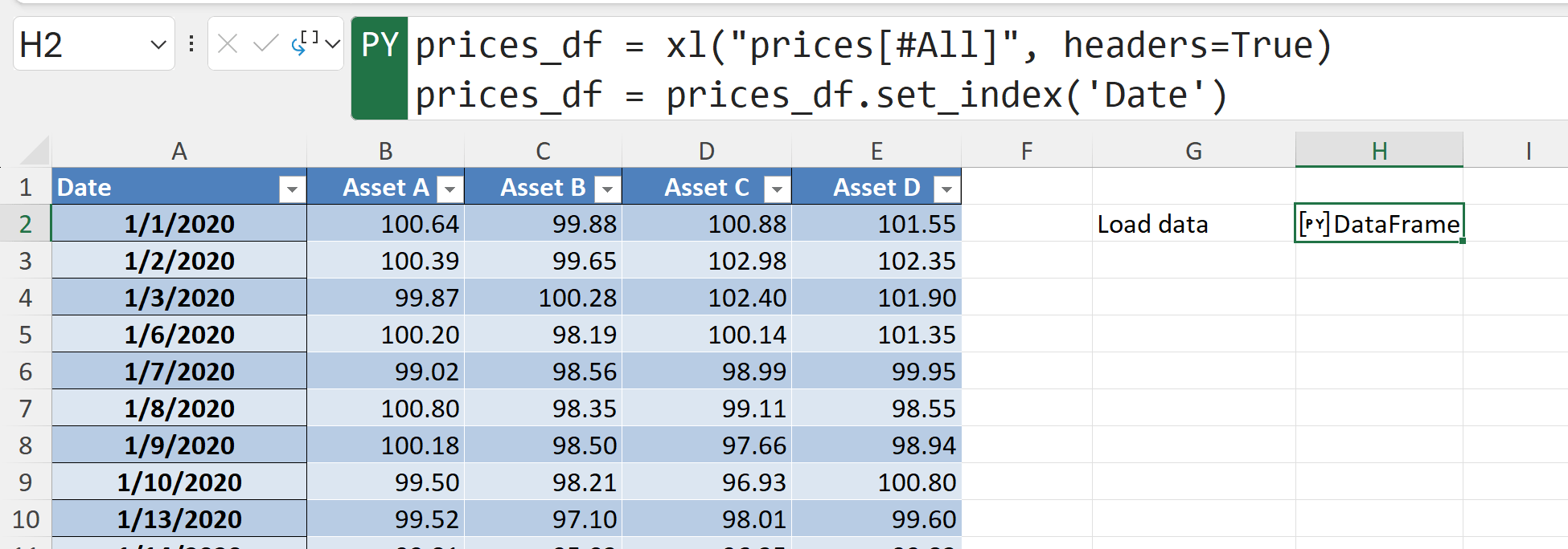
We’ll start by loading the Excel table of daily asset prices into a Python DataFrame, explicitly setting the date as the index to simplify time-series analysis. With the data neatly structured, we can efficiently calculate returns, correlations, and risks: critical building blocks for creating and visualizing the efficient frontier.
Next we’ll calculates the daily returns of the assets by applying .pct_change(). We’ll also use .dropna() to remove the initial row containing missing values from the calculation. This step further prepares the dataset for generating an efficient frontier.

Next, the daily returns calculated earlier are converted into annualized figures by multiplying by the typical number of trading days in a year (252). Specifically, mean_returns provides the average annual return per asset, and cov_matrix_df represents how the asset returns move together annually, capturing risk and correlations. These annualized measures are key inputs when calculating portfolio risk and return for building an efficient frontier.

The next sections are a bit longer to derive, so I’ve included the code as a Gist below. You can also find it in the completed workbook.
Our next step is to randomly generate 10,000 hypothetical portfolios by assigning different asset weights. We’ll calculate each portfolio’s annual return and volatility using previously computed mean returns and the covariance matrix, and then computes the Sharpe ratio (return-to-risk). The resulting metrics are stored and organized into a DataFrame, providing the data points needed to visualize and identify optimal portfolios along the efficient frontier.
Before we head to plot our results, we’ll formally extract the efficient frontier by sorting all generated portfolios by return and then iterating through them to identify portfolios with the lowest volatility for each level of return. As it moves through the sorted list, it only adds a portfolio to the frontier if it has a volatility lower than any portfolio previously encountered, effectively mapping the curve of optimal risk-return combinations.
The resulting lists (frontier_ret and frontier_vol) represent the return and volatility points of portfolios lying on the efficient frontier.
Last but not least, we’ll create a scatterplot of the risk-return trade-off of all randomly generated portfolios as individual points, with volatility on the x-axis and returns on the y-axis. Overlaying these points is the efficient frontier curve, which represents portfolios offering the highest return for each level of risk. This clearly shows investors the optimal set of portfolios from which to choose, highlighting the most efficient allocation of assets.
And now you should see something like this in your Excel workbook:

Practically, an investor would look at this chart to choose a portfolio aligned with their risk tolerance. If an investor wants to maximize returns and can handle more ups and downs in portfolio value, they’ll select portfolios toward the upper-right. If they’re more conservative, preferring stability, they’ll move toward the lower-left side, aiming for portfolios with less volatility, even if returns are somewhat lower.
Investors focus specifically on portfolios along the outer edge (i.e., the efficient frontier) since these portfolios offer the best returns for a given risk level. You wouldn’t select portfolios in the bottom half of the curve, as these portfolios provide lower returns for the same risk, nor would you choose any of the points inside the frontier, because these interior portfolios represent less efficient combinations, offering lower returns or higher volatility compared to those directly on the efficient frontier. This chart provides a clear visual framework to quickly identify the optimal balance between risk and reward for individual investment goals.
In this post, you’ve seen how Python in Excel dramatically streamlines the process of generating and visualizing the efficient frontier—making advanced portfolio optimization accessible without leaving your familiar Excel environment. You’ve learned how to leverage Python’s power to perform sophisticated financial analyses, unlocking insights that were previously challenging or impractical using Excel alone.
If you’re ready to deepen your skills further, consider exploring Monte Carlo simulations, advanced risk modeling, or other quant finance methods, all enhanced through Python in Excel. And of course, if you have questions or you’re looking to grow your team’s Python in Excel for finance expertise even further, please leave a comment below or get in touch.