In a previous post, we explored the Seaborn library and highlighted its fundamental plot types, showcasing how it simplifies the creation of visually appealing and insightful data visualizations directly in Excel using Python:
In this post, we’ll take it a step further by diving into advanced, statistically driven plots—charts that Excel often finds challenging to replicate. This makes Seaborn an invaluable tool for Excel users looking to expand their data visualization capabilities.
Download the exercise file below to follow along:
Pairplot
A pairplot generates a grid of scatterplots for all combinations of numerical variables, with kernel density estimate (KDE) plots along the diagonal to display their distributions. This visualization is excellent for exploratory data analysis, helping to uncover correlations, clusters, or patterns across variables. While Excel could create these plots individually with some effort, replicating them for all pairwise relationships would require significant time and manual work.
In this plot, penguin species are color-coded for quick differentiation. KDE plots on the diagonal replace histograms for a smoother representation of distributions. Use this chart when you want to analyze how multiple variables interact at a glance.

Jitterplot/stripplot
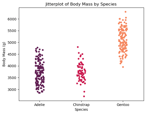
The next plot is called a stripplot in Seaborn, but it’s often referred to as a jitterplot elsewhere. It’s similar to a scatterplot, except one of the variables is categorical. By adding a bit of random noise to the data along one axis, we can better visualize each individual value. Since the data points aren’t aggregated and each one is plotted separately, it provides a clear, granular view of the data.

Here, body mass values for each penguin species are spread horizontally with slight random noise.
Jointplot
A jointplot combines a central scatterplot with marginal plots, such as histograms or KDE plots, along the axes. This dual view provides valuable insights: the scatterplot shows the relationship between two variables, while the marginal plots highlight their individual distributions.
However, when dealing with larger datasets, plotting every individual point in a scatterplot can overwhelm the visualization, making it cluttered and difficult to interpret. To address this, we’re going in almost the opposite direction of the stripplot by binning the data points into hexagonal bins (hexes) instead of plotting each one. This approach aggregates observations within each hex, giving us a cleaner, more scalable visualization that highlights density patterns rather than individual values.
Additionally, the jointplot is designed to emphasize the relationship between the two variables in the main plot while still retaining a clear view of their separate distributions along the margins. This interplay between the joint and marginal views helps in understanding both the combined and individual behaviors of the variables, offering a more comprehensive perspective on the data.

Hexagonal bins are used here to represent density, with color intensity indicating the concentration of data points.
Heatmap
A heatmap is a color-coded visualization of a correlation matrix, useful for quickly spotting relationships between numerical variables.

Before creating one, it’s important to clean the data by dropping rows with missing values and selecting only quantitative variables since correlations require numeric inputs.
In the penguins_df dataset, we preprocess it by removing missing values with penguins_df.dropna() and selecting numerical columns like bill_length_mm, bill_depth_mm, flipper_length_mm, and body_mass_g for the correlation matrix. The heatmap is created using sns.heatmap(), where annot=True displays the correlation values in each cell, cmap='coolwarm' sets a gradient from cool (negative correlation) to warm (positive correlation), and fmt=".2f" ensures values are shown with two decimal places.
This visualization is a powerful tool for identifying patterns and redundancies in numerical datasets, making it ideal for pre-modeling analysis.
Swarmplot
Swarmplots are a powerful way to visualize distributions across categories, particularly when you want to retain individual data points without them overlapping. They are closely related to stripplots, which also display raw data points but allow overlaps. The key difference is that swarmplots rearrange the points along the categorical axis to avoid collisions, creating a clearer view of the data’s distribution.

For instance, in the example with swarmplot(), penguin flipper lengths are plotted against their islands of origin, with species differentiated by color. This arrangement provides a clear view of how data points are distributed within each category and makes it easy to spot trends or variations among species.
Conclusion
In conclusion, we’ve covered an impressive range of statistically focused plots you can create with Seaborn: from pairplots for uncovering relationships across variables, to stripplots and swarmplots for exploring detailed, category-specific distributions, and jointplots and heatmaps for revealing deeper statistical patterns.
These visualizations open up opportunities for insights that go far beyond Excel’s default charting capabilities. And there’s so much more you can create with Seaborn—check out the Seaborn documentation gallery for inspiration.
What I really love about Seaborn is that all these visualizations are just functions—straightforward and familiar to Excel users. With a bit of practice, these tools are well within reach for anyone looking to take their data visualization skills to the next level.
What questions do you have about Seaborn specifically, or about data visualization with Python in Excel more broadly? Let me know in the comments.
