One of my favorite applications of Python is time series analysis, particularly through the use of the Pandas package. This package was designed, in large part, to handle time series data in ways that Excel cannot always manage.
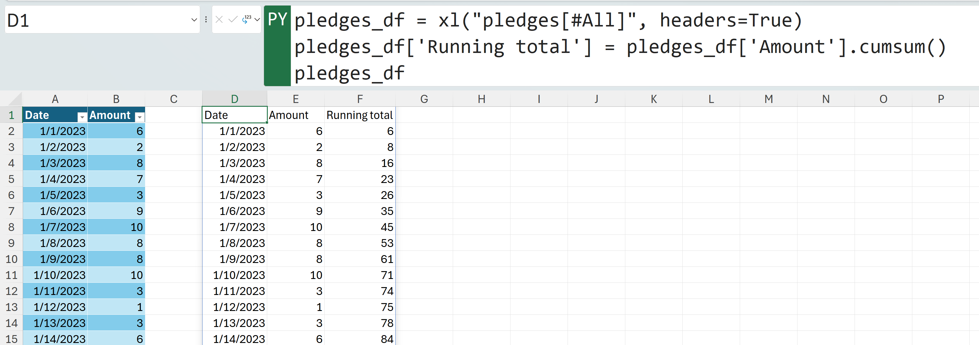
Consider, for example, a running total. While constructing a basic one in Excel is not particularly challenging, configuring it to seamlessly work with expanding data sources can be somewhat difficult. Pandas addresses this challenge by providing a simple syntax that is not only optimized for time series data but also dynamic enough to adapt to changing characteristics of the source data.
To follow along, please check out the exercise file provided below:
In this dataset, we track the number of pledges made to a campaign and compare it to our overall pledge goal.
For this post, I’ll proceed under the assumption that you’re proficient in importing Excel tables into Python and utilizing Python for plotting within Excel. Additionally, it’s assumed that you’re familiar with creating basic calculated columns and charts using Python. If this isn’t the case, I recommend my book Advancing into Analytics.
Calculating a running total in Pandas is straightforward enough. To achieve this, we’ll simply create a new column by applying the cumsum() method to the Sales column.

Adjusting the size of the source table or the calculated column does not affect its functionality—it’s as straightforward as that.
Having addressed the calculation itself, let’s shift our focus to visualizing this data, aiming to enhance its interactivity and assist users in monitoring its progress.
A practical approach could involve generating a line chart to observe the evolution of the running total over time. I plan to also include my pledge goal as a horizontal line within this chart, providing a clear comparison to ascertain whether the goal has been achieved or to gauge any shortfall.
Let’s go ahead and do this with a combination of seaborn and matplotlib.pyplot functionality:

This chart is quite impressive, but it’s missing a crucial element that all charts should have: a title. Let’s fix that. However, instead of opting for a simple title, let’s make it a little more interesting with some dynamic inputs.
To start, I’ll incorporate a section in the workbook that allows the user to dynamically adjust the pledge goal, which will, in turn, alter the chart’s horizontal line accordingly.
Following that, I’ll introduce a dynamic chart title. Should the pledge goal be reached, the chart will display the date on which this milestone was achieved. Conversely, if the goal remains unmet, the chart will indicate the number of pledges still required.
These new requirements have made the code somewhat more complex, and it can’t be neatly captured in a single screenshot. Below, you’ll find the code snippet instead.
It utilizes an if statement in Python to determine the appropriate title for the plot, which is then set as the plot’s title. For those eager to delve deeper into Python programming fundamentals, I again recommend my book Advancing into Analytics.
This provides you with a tool like the following.
Here, the user can effortlessly insert a new pledge goal and determine whether it has been achieved or not.

You can further customize this chart by dynamically changing its color to indicate whether the pledge goal has been met. Additionally, you might consider forecasting the expected time to achieve this goal. Both tasks can be efficiently accomplished using Python within Excel.
I hope this post has demonstrated a quick win for integrating Python with Excel, especially for time series data. Do you have any questions about using Python in Excel for time series analysis or anything else? Please share your thoughts in the comments.
Additionally, if you’re aiming to enhance your team’s skills to maximize the impact of financial data in Excel using Python, consider exploring my Python Foundations for Finance corporate workshops:
