This summer I am taking a course on measurement theory … which is as difficult as it sounds. But one of the complications of the course has little to do with sophisticated statistics or management theories.
It is a problem faced by analysts everywhere, at any level of analysis: the formatting and presentation of the numbers takes almost as much effort as actually analyzing them.
In this seminar, we want to mimic the style of statistical reporting of a top management publication, The Academy of Management Journal (AMJ). This insistence has become a running joke among my classmates. I even made a meme about it:

But data formatting and presentation is essential. Copy-and-pastes from statistical software outputs are not allowed. We must create a narrative with the data, make it easy to digest. And Excel is a great tool for data presentation. Here I show how Excel can be used to automate a common formatting practice in statistical reporting.
This is not a post about statistics. Some prior knowledge of the subject is preferred, but if you have no prior background, you can follow along with the Excel steps all the same.
It is common to report statistically significant p-values with an asterisk. Let’s say, for example, you want to report p-values at the .05 level — any number below this threshold should be followed by an asterisk.
You can use conditional formatting in Excel to automate this process.

Download the exercise file here.
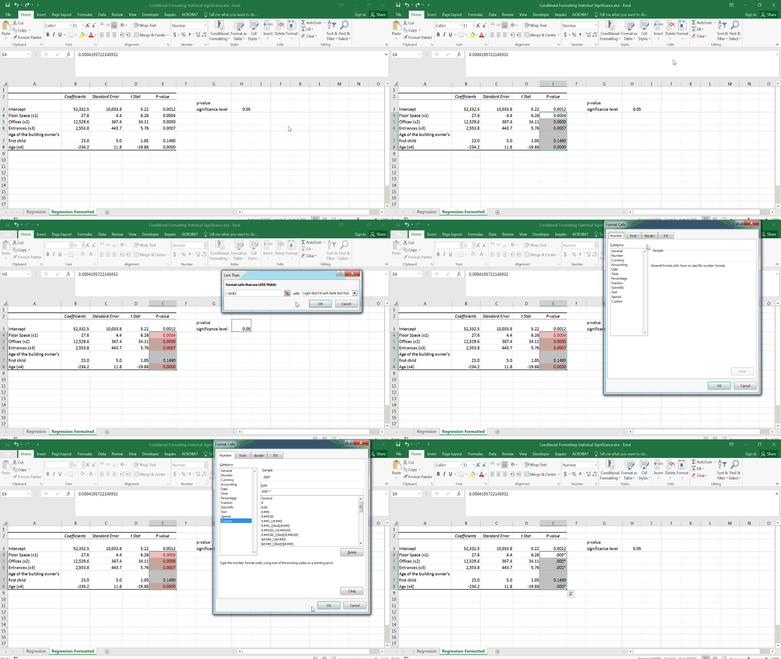
Below is a mock regression predicting office building sales prices.

Reading through the variables, it might not surprise you that while the age of the building and floor space are significant predictors of sales price, the age of the current building owner’s first child is not.
Easy enough to read this table. But imagine you are skimming dozens of these, as a journal referee or grant reviewer might, for example. You want to fly through these findings and know what is statistically significant off the bat.
Conditional Formatting, Always Significant!
With conditional formatting, we can format with an asterisk all values below a certain number. This is not a default format in the conditional formatting menu, so we will need to write our own cell formatting tool:
After selecting what cells we want to format (all p-values excluding the intercept) on the condition that they are less than a certain value (cell H3), we need to specify a custom cell format to add the asterisk to these values:

The last entry on the Number tab of the Format Cells menu is “Custom.” Go there and you can do almost anything with your cell format.
In this case, I will add an asterisk to our cell output by adding “*” to the end of the string. I also change the format from General to .000. This forces the cell to display the value to three decimal points, with no zeroes.

P values are always a decimal, so it is a waste of space to include a zero!
Now I do the same for the values less than cell H3. You may have noticed the added asterisk throws off the alignment of values in column E.

Be sure to enclose your custom-formatted characters in quotation marks.
To correct for this, I add two space marks instead of an asterisk. This way, the values with and without the asterisk appear aligned.

This is not just for hard-coded results — conditional formatting works the same on formula-derived values, too. For example, here we want to see if the difference in chi-square values between two models is significant.
I set up conditional formatting the same way as above, except the target cell is a formula.

It works entirely the same.
One last pitch…
If you plan to format p-values frequently, consider purchasing my Statistical Significance Formatter Add-In. This will allow for a dynamic, repeatable approach to formatting p-values so you can easily change your cut-off value and not have to repeatedly set up the special cell formats. The above tedious process becomes something like this:

Download the add-in here.
Weapons of Excel Creation
Custom cell formatting is one of Excel’s most powerful tools, and one that makes it irreplaceable. Ever heard the old saw that all these alleged “Excel-killing” BI tools still have an Export to Excel button?
Maybe I can do these stats easier in R. But to present a narrative with my data, Excel is still an excellent tool choice.
