This post accompanies my segment on MyExcelOnline’s “Best Excel Tips of 2017 Podcast.”
The first commandment of data analysis:
KNOW THY DATA!
It’s always smart to get a feel for your data’s distribution. Histograms offer a great way to visualize the distributions of a variable of interest.
Download the exercise file here.
A histogram is a bar-chart visualization where the data is grouped into ranges. While Excel offers a built-in histogram chart, I like to build them using (drumroll…) PivotTables.
The exercise file contains sales quantity and dollars. I want to know the distribution of sales quantity per transaction. For example, how many transactions involved 2 items? 6 items?
Our steps:
1. Add a Count variable to your dataset
This looks goofy, but it’s a shortcut for our next steps. I will simply drag and fill the number 1 down our entire dataset.

2. Insert PivotTable
I put our sales quantity in the Rows box and the “Count” variable in the Values box. Now we have a count of the number of transactions per sales quantity which we will visualize with a histogram.

3. Insert PivotChart
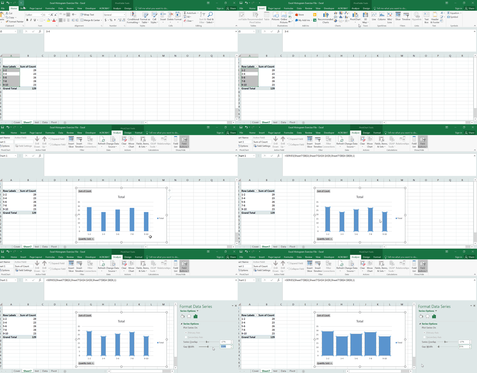
Next, I insert a PivotChart based on this PivotTable data.
An extra tip: Usually histograms are displayed with the bars quite close, even touching each other.
To reduce the gaps between bars, right-click on any of the bars in the histogram and select “Format Data Point.” You will see a scroll-bar labeled “Gap Width.” Reduce the width to about 25%, or whatever you prefer.

4. Slice and Dice!
The true power of this method come when you want to re-group the number of “bins” in your histogram. Let’s say that you want to visualize the groups in increments of two.
Simply right-click your PivotTable, select “Group” and build your table in increments of 2. Change to 3, 5… whatever.
Now you get a sense of how this variable is distributed and can get a better sense of the average unit per transaction – does it skew high or low? Or does it appear normal? In this case the number of units per transaction appears about consistent across the range.
Notice in the GIF that when I set the histogram to intervals of five, the difference between groups looked pretty serious!
That’s because I allowed Excel to default to a cardinal sin of data visualization, floating the Y axis from 0! Because the Y axis floated to 63, of course a difference between 64 and 65 looks high.
For shame.

I made the correction in the exercise file.

Now get out there and know thy data — but first, subscribe to my newsletter and get your FREE copy of the “Beginner’s Guide to Getting Hired with Excel.”
