One of the hardest Excel features to master is charts and graphs, which aren’t always so user-friendly.
That “Select Data Source” dialogue box is so sensitive that it could drive you crazy!

Select Data Source: a common source of frustration when working with Excel charts.
Turns out there is a way to add data to a chart without using that dialogue box.
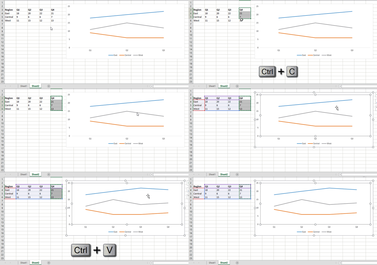
In our example, we have graphed data from Q1-Q3 and want to add Q4.
Did you know you can simply copy and paste the data you want graphed into your chart and it will update?

How it works:
1. Select the range of data (including labels) you would like to add to your graph.
2. Ctrl + C to copy range.
3. Click anywhere on chart.
4. Ctrl + V to paste.
5. Your graph is updated! No dialogue box required.
Download the exercise file here.
h/t to Excel TV’s new course on data visualization for teaching me this trick.
