Data visualization plays a crucial role in simplifying complex data, uncovering patterns, and effectively conveying findings to others. However, starting a new chart can be daunting. With a plethora of chart options available, choosing the best starting point can be challenging.
Fortunately, Copilot can offer assistance by providing suggestions that inspire deeper analysis and enhance visual representations.
To explore this using a dataset containing information about the largest cities in the US by population, download the following exercise file:
Ensure you have completed all necessary steps to load your data into Copilot to proceed:
Asking for basic plots
To begin our exploration, we will instruct Copilot to generate a visual representation of the population sizes across different cities with the command: “Plot the population of each city.” In response, Copilot recommends using a bar chart, which is an excellent choice for visually comparing the populations.

We then have the option to add the chart to a new sheet. It’s worth noting that Copilot often inserts items into Excel as a PivotTable and PivotChart, even when no aggregation is necessary, as in this example. Therefore, it’s important to ensure you’re comfortable working with these features in Excel.

Copilot is also likely to provide a brief written description of the plot to assist in interpretation, or you can use it as a starting point to share with colleagues to aid in their understanding.
We can further our analysis by exploring various data aggregations. For example, we could ask Copilot to present the average city area, distinguished by whether it is a capital or not:

As you’ve observed, Copilot often prefers bar charts in these scenarios, illustrating a key principle: Although there’s a strong temptation to innovate for the sake of novelty, it’s unnecessary to resort to overly elaborate solutions without a compelling reason.

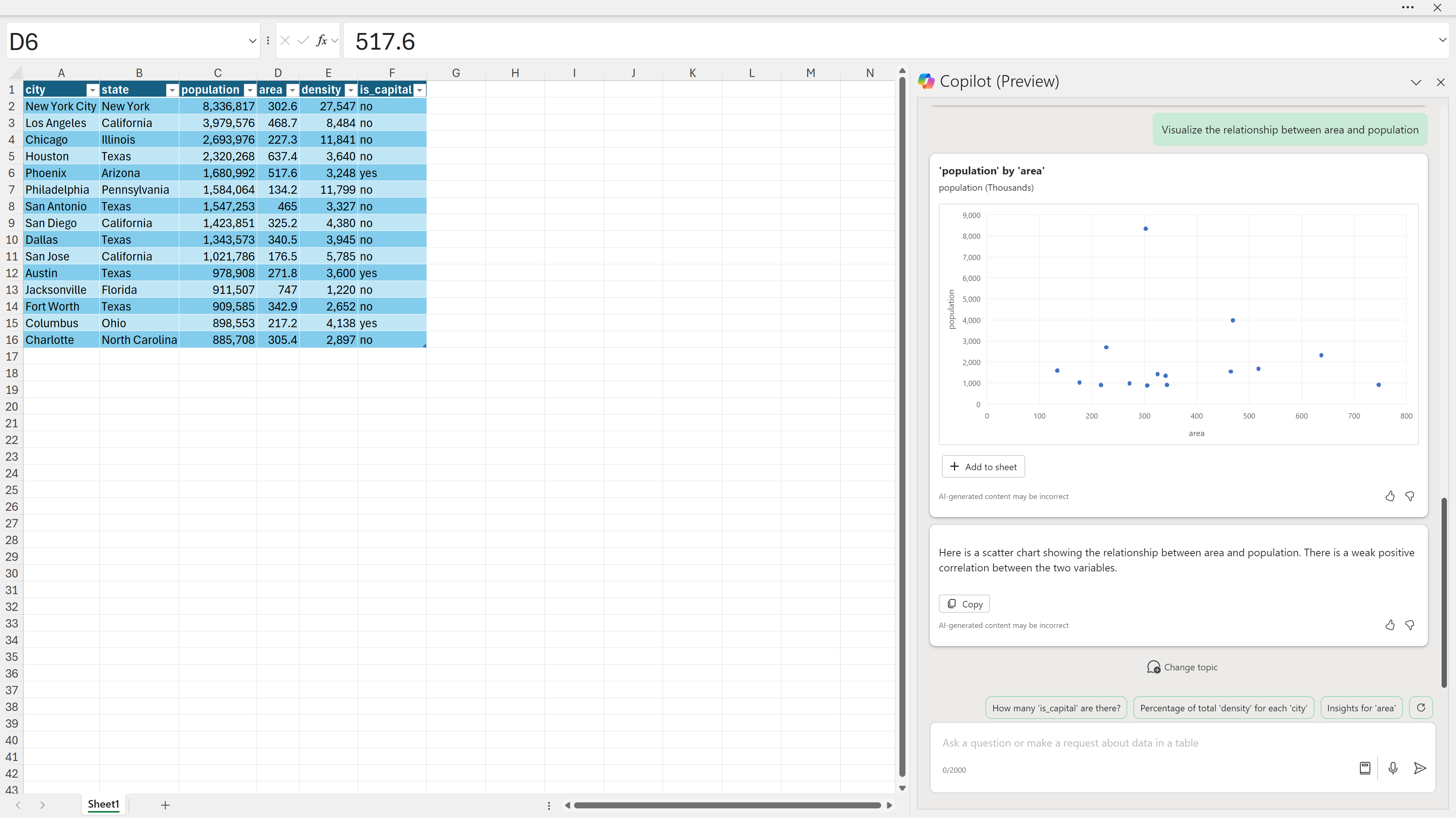
Now, let’s consider a scenario where a bar chart might not be the most suitable option—such as when demonstrating the relationship between two quantitative variables, like area and population. In this instance, a scatterplot is more appropriate, and Copilot quickly offers this option.

Customizing the chart
At present, Copilot might offer limited functionality for customizing plots, but Excel provides users with complete control over this aspect. For instance, one could add a trendline to the previously mentioned scatterplot to analyze the correlation between city area and population, as well as include a title for enhanced readability.
Conclusion
In summary, Copilot streamlines the data visualization process by recommending efficient and straightforward chart types such as bar charts and scatterplots. It underlines that practicality often outweighs the desire for novelty, allowing users the opportunity to fine-tune and customize their visualizations further.
For experienced data visualization users, this feature might not seem too exciting, as they are likely already familiar with when to use a scatterplot versus a line chart, etc. However, for new Excel users, this could be a very accessible way to begin with the visualizations most appropriate for their data. Additionally, for those needing to generate plots quickly, such as in a meeting, this could be quite helpful. This tool offers a more directed, interactive approach with fewer “false positives” than one might find with the basic Recommended Charts feature.
Do you have any questions about data visualization with Copilot for Excel, Copilot for Excel more broadly, or even AI for Excel in general? Please let me know, and don’t hesitate to reach out if you’re interested in helping your team maximize their use of Excel with AI.
