Including charts in your PowerPoint presentations can significantly improve data visualization, making the information more digestible and engaging for your audience. However, analysts often face challenges when trying to determine the most efficient way to incorporate charts, considering their specific needs and the available options.
When working with Excel charts, there are three main ways to add them to PowerPoint: inserting the chart as an image, linking it to the original Excel workbook, or embedding the data directly within the PowerPoint presentation. Let’s explore each method using a simple chart that compares the land area of New York City’s five boroughs.
You can download the exercise files for this blog post here:
You’ll find two files: excel-chart-to-powerpoint-demo.xlsx, which contains the raw chart and data used in the demo, and excel-chart-to-powerpoint-demo.pptx, which demonstrates each of the three methods in action with that chart.
Method 1: Inserting as an Image
The simplest option is to insert the chart into PowerPoint as an image. Start by selecting the chart in Excel and copying it. In PowerPoint, go to the slide where you want the chart to appear, right-click the desired location, and choose “Picture” from the paste options (the last one in the paste settings):

Resizing the chart is simple and quick, making it ideal for easy insertion without modifications.

Inserting the chart as an image is straightforward and requires minimal steps. It avoids compatibility issues between Excel and PowerPoint versions and keeps the file size small since no underlying data is embedded.
However, the chart becomes static, meaning you can’t edit it or its data in PowerPoint. Changes in the original Excel file won’t update in the slide, and resizing the image may reduce quality, affecting clarity and professionalism.
Method 2: Linking to the Excel Workbook
Now, let’s link the chart to the original Excel workbook, so it updates automatically when the Excel data changes. Copy the chart again, and when pasting in PowerPoint, select the third or fourth option to link it. “Keep Source Formatting” preserves the Excel chart’s original look, while “Use Destination Theme” adjusts the chart to match PowerPoint’s design.

The primary benefit of linking is that it keeps your presentation data current. Any updates to the Excel file are automatically reflected in your PowerPoint chart, ensuring consistency and accuracy.

On the downside, linking creates a dependency on the original Excel file. If the Excel file is moved, renamed, or deleted, the link breaks, and the chart may not display correctly in your presentation. This dependency can pose challenges when sharing the presentation with others.
Method 3: Embedding the Data in PowerPoint
Finally, embedding the chart and its data directly into PowerPoint creates a self-contained presentation. To do this, copy the chart from Excel and paste it into PowerPoint using one of the first two paste options. This embeds the Excel worksheet within your PowerPoint file, enabling you to edit both the chart and data directly within the presentation.

The key advantage of embedding a chart is that it makes your presentation portable and independent of external files. You can modify the chart and its data on any computer without needing access to the original Excel file. This is especially helpful when sharing the presentation or using computers that may not have Excel installed.

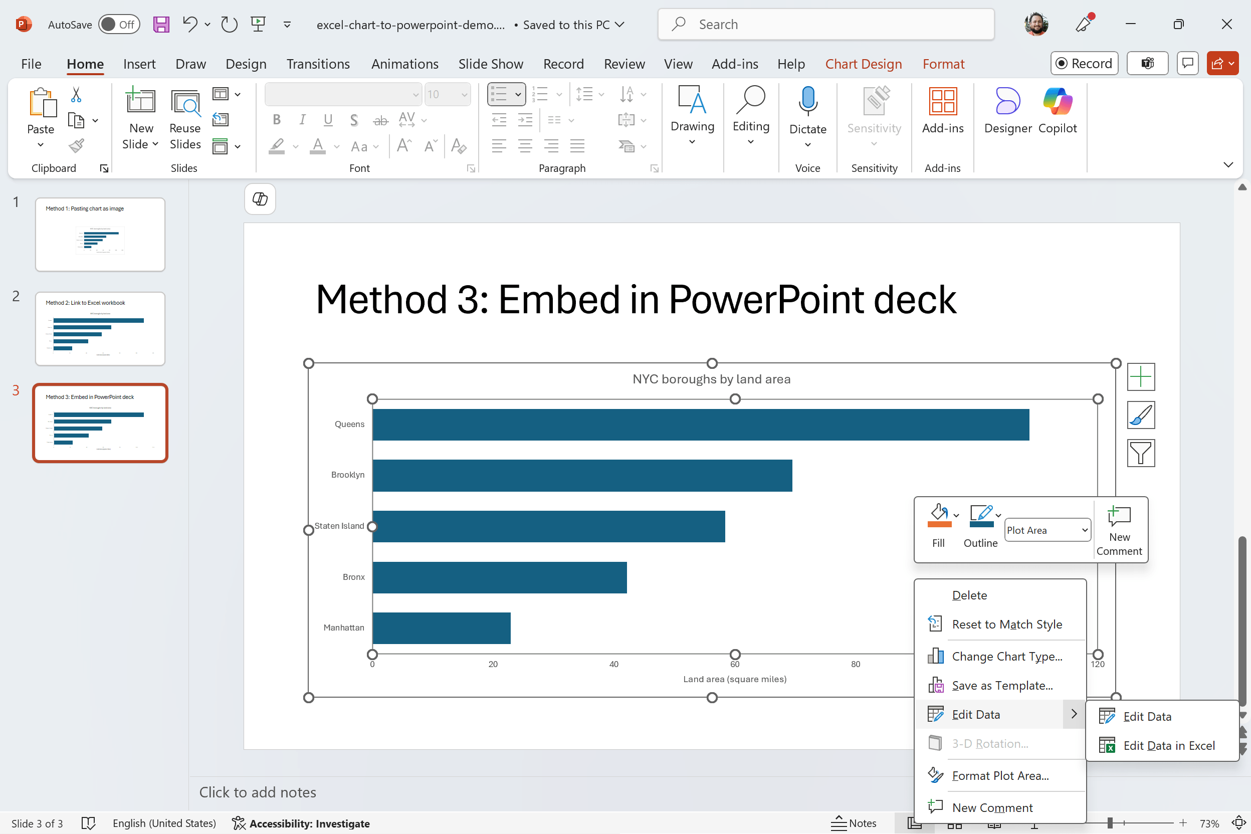
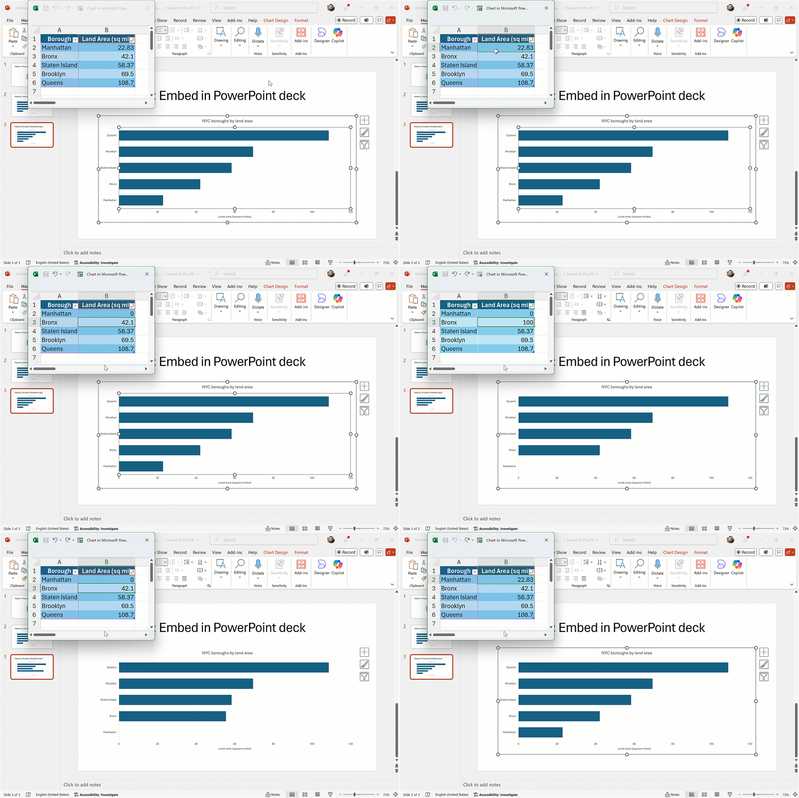
To embed a chart, right-click on it and select Edit Data. You can either edit the data in a smaller pop-up box within PowerPoint or open it in the full Excel application for more space. Keep in mind, this is an embedded workbook—not linked to the original data source. If you choose the option to link the data, any changes you make will affect the original Excel file as well.

However, embedding increases the file size of your PowerPoint presentation because it includes the entire Excel worksheet. This can be a concern if you’re dealing with large datasets or need to distribute the presentation electronically where file size limitations exist. Additionally, any changes made to the original Excel file after embedding will not be reflected in your presentation, potentially leading to discrepancies if you’re not careful to update both sources.
Conclusion
The table below summarizes the pros and cons of each method. There’s no single “right” way to do it, which is why all of these options are available. You might even have another method you prefer—feel free to share it in the comments! Hopefully, this gives you enough information to understand the various options and get started.
I hope this helps you enhance your PowerPoints with compelling visualizations that are easy to update and manage! Do you have any questions about moving Excel charts to PowerPoint or data visualization in Excel in general? Feel free to ask in the comments.
