
If you work in finance, accounting, or a related field, chances are you’ve had to put together a forecast… and then explain why you built it the way you did. Excel makes that process feel deceptively simple. With functions like FORECAST.LINEAR() or FORECAST.ETS(), or even the Forecast Sheet wizard, you can generate a projection in just a few clicks. But these tools don’t really help you answer the follow-up questions: How accurate is this forecast? Does another approach perform better?
That’s the missing piece. To judge whether a forecast is reliable, you need to measure it against actual results. In this post, we’ll walk through how to calculate common evaluation metrics like MAE, RMSE, and MAPE directly in Excel, and we’ll see what they reveal about the strengths and weaknesses of a forecast. Along the way, we’ll also look at why Excel’s legacy tools make serious model-to-model evaluation difficult.
This is Part 1 of a two-part series. Here we’ll focus on what you can do with built-in Excel functions and features. In Part 2, we’ll raise the bar with Copilot and Python in Excel to build smarter forecasts and evaluate them more effectively.
You can follow along with a synthetic retail sales dataset by downloading the exercise file below:
Splitting the data into training and testing sets
To properly evaluate a forecast we need to give it a fair test. That means splitting our dataset into two parts. Most of the history will act as the training data, which is what the model uses to build its predictions. The most recent 12 months will be set aside as testing data, which the model does not see during training.
This step is important because if you measure accuracy on the same data used to build the forecast, the results will look much better than they really are. It is like grading a student on an exam after giving them all the answers. By holding back the last year of actual sales, we can compare the forecast against numbers the model did not have access to. That gives us a much clearer view of how the forecast would perform when faced with the unknown future.
In Excel, we can use simple formulas to mark which rows belong to training and which belong to testing. This keeps the process transparent and makes it easy to follow along.
There are lots of ways to split this dataset, but I’m going to use dynamic array functions to create the train and test datasets.
For the train set:
=FILTER(
retail_sales,
retail_sales[Date] < EDATE(MAX(retail_sales[Date]), -11)
)
For the test set:
=FILTER(
retail_sales,
(retail_sales[Date] >= EDATE(MAX(retail_sales[Date]), -11)) *
(retail_sales[Date] <= MAX(retail_sales[Date]))
)
These formulas work by taking the maximum date in the dataset, stepping back 11 months with EDATE, and then filtering rows based on those date ranges. The train set pulls everything before that cutoff, while the test set captures the most recent 12 months. Because these are formulas, the split will update automatically if new rows get added.
Your worksheet should now show the data divided into training and test sets. Next, add three extra rows at the top reserved for forecast evaluation using MAE, RMSE, and MAPE. These metrics give us a consistent way to judge whether one forecast is performing better than another.

MAE, or Mean Absolute Error, shows the average size of the errors. RMSE, or Root Mean Squared Error, does the same but penalizes larger misses more heavily, which can be important in business settings. MAPE, or Mean Absolute Percentage Error, expresses the error as a percentage, which makes it easy to communicate results to others.
In each case, we calculate the metric by comparing the forecasted values to the actual values in the test set and then averaging the results. This gives us a fair, side-by-side way to evaluate different forecasting methods.
I’ll share the formulas for this in just a moment when we set up the linear forecast.
Building a linear forecast with FORECAST.LINEAR()
We’ll start by creating a basic forecast using the FORECAST.LINEAR() function:
=FORECAST.LINEAR(I9, retail_sales[Retail_Sales], retail_sales[Date])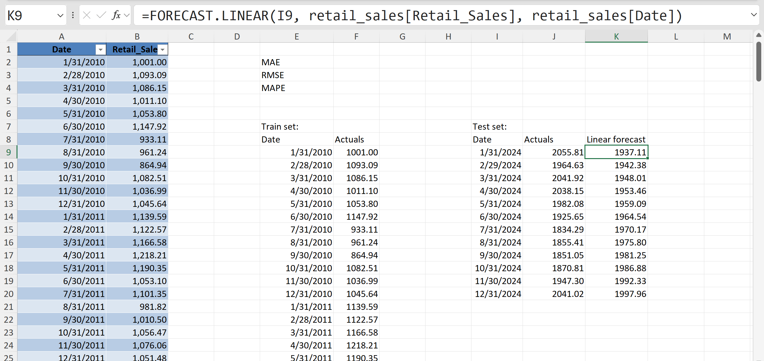
This is Excel’s simplest way to create a forecast. It fits a straight line through the historical data and then extends that line forward to predict future values. In the screenshot, the function is being used on the test set dates to generate a “linear forecast” for each of the last 12 months.
This gives us two sets of numbers side by side: the actual sales and the forecasted values. At this stage, even before calculating accuracy metrics, a good first step is to simply compare the forecasts to the actuals visually or in a table. By lining them up in two columns with actuals in one, forecasts in the other we can quickly spot whether the forecast is generally too high, too low, or missing obvious patterns.
There are more automated ways to do this kind of evaluation, but since this is a one-off example, we are keeping it manual and straightforward. For now, the main goal is just to see what the forecast looks like and start building intuition before we dive into the formal accuracy measures.

The previous chart shows our simple linear forecast compared to the actual sales. If you want to avoid a gap between the two lines, one quick trick is to include the last actual value as the first point of the forecast series. That way the forecast picks up exactly where the actuals leave off.
Even so, what we see here is a straight line projection. It does capture the overall upward trend in sales, but it completely ignores the seasonal ups and downs that are so obvious in the historical data. That lack of seasonality is a real limitation: if your business depends on cyclical patterns, a linear forecast like this can be misleading.
As we start to compare different models, it will be important to have good benchmarks for measuring performance. To that end, let’s calculate three key metrics in Excel. In our worksheet, the actuals are in column J and the linear forecasts are in column K for the test set. We’ll now use simple formulas to generate MAE, RMSE, and MAPE at the top of the sheet.

MAE, or Mean Absolute Error, is calculated with =AVERAGE(ABS(J9:J20 - K9:K20)). Excel subtracts each forecast from the actual, takes the absolute value so negatives do not cancel positives, and then averages those differences. This shows us, on average, how far off the forecast is.
RMSE, or Root Mean Squared Error, uses =SQRT(AVERAGE((J9:J20 - K9:K20)^2)). This works in almost the same way, but instead of absolute values, the differences are squared before averaging, and then the square root is applied at the end. Squaring emphasizes larger errors, so RMSE gives more weight to big misses.
MAPE, or Mean Absolute Percentage Error, is calculated with =AVERAGE(ABS((J9:J20 - K9:K20) / J9:J20)). This divides each error by the actual value, takes the absolute percentage difference, and then averages them. The result is a percentage that is easy to interpret: on average, the forecast was off by a certain percent.
All three formulas rely only on basic Excel functions like ABS(), AVERAGE(), and SQRT(), which makes them quick to set up. Together, they give us a rounded view of forecast accuracy: MAE for a simple average error, RMSE for error severity, and MAPE for a percentage that is easy to communicate.
With our forecast visuals and accuracy metrics in place, we can now start exploring alternative models.
Building a exponential smoothing forecast with FORECAST.ETS()
Using FORECAST.LINEAR() gives us a forecast, but it assumes the data follows a straight-line trend. Most business datasets, like retail sales, don’t behave this way because of seasonality and other repeating patterns. That is where FORECAST.ETS() comes in. ETS stands for Exponential Triple Smoothing, and it is designed to capture both trend and seasonality rather than forcing everything into a simple line.
The real test is whether ETS actually performs better than linear forecasting. To find out, we will measure both approaches on our holdout data using metrics like MAE, RMSE, and MAPE. That way we can directly compare accuracy and see how much the seasonal adjustment helps.
Our next, step, then is to use the FORECAST.ETS() function to generate forecasts for the test set:
=FORECAST.ETS(I9, retail_sales[Retail_Sales], retail_sales[Date])
This forecast looks very similar to the linear version, but under the hood it is much more complex. FORECAST.ETS() applies Exponential Triple Smoothing, which can account for both trend and seasonality in the data. Excel does allow you to pass additional arguments to fine-tune seasonality, confidence intervals, and other options, but for our purposes we can leave those arguments blank and rely on the defaults. That keeps the function easy to use while still giving us a stronger model than a straight line.
On the right, you can see how the ETS forecast values (column L) are now lined up with the actuals (column J). We have effectively filled in the test set with a new set of predictions, giving us something to directly compare to the linear forecast. Great work. This is exactly what we need to start evaluating how ETS performs.

Go ahead and recreate the formulas, this time comparing the actuals against the ETS forecast values in column L. That way we are measuring accuracy for this new model. The formulas are the same as before, just swapping in the ETS forecast range.
Looking at the results, the ETS forecast shows a MAE of about 31, RMSE of about 35, and MAPE of about 2%. These numbers are much lower than what we saw with the linear forecast, where MAE was about 81, RMSE about 91, and MAPE about 4%.
So how do we interpret this? Lower error values mean the ETS model is doing a better job at capturing the actual sales. MAE tells us the typical error dropped from roughly 80 units to about 30 units. RMSE shows that big misses are also smaller with ETS, falling from over 90 units to around 35. And MAPE shows the forecast is now off by only about 2 percent on average, compared to 4 percent before.
The takeaway is clear: FORECAST.ETS() is giving us a more accurate forecast than FORECAST.LINEAR() because it can account for the seasonality in the data.
Building an exponential smoothing forecast with Forecast Sheet
Even though our accuracy metrics show that ETS is performing better, it is still a good idea to build a visual. Numbers can confirm performance, but charts often reveal patterns and gaps that metrics alone might miss. We could build this chart manually, but Excel gives us an easier option with the Forecast Sheet wizard:
This tool automatically generates an ETS forecast chart and includes confidence intervals, giving us both the forecast and a sense of its uncertainty. Let’s run Forecast Sheet on our dataset and see what it produces.
To create the forecast, start by selecting the training dataset (i.e., not including the 12 months we set aside) in your worksheet. Then go to Data > Forecast Sheet. Just like the FORECAST.ETS() function, the wizard includes quite a few customization options, and you’ll even see a preview of the chart before you commit. For now, I’ll leave the default settings and click OK to generate the forecast.

When you use Forecast Sheet, Excel is really just running FORECAST.ETS() behind the scenes. In that sense it’s a glorified version of what we already built manually, organized in Excel Table format. The difference is that Forecast Sheet gives you more structure: it outputs a full table with the forecasted values, plus the upper and lower confidence bounds, and it automatically generates a chart that ties it all together.
The included chart shows the blue line for historical values, the red line for the ETS forecast, and the confidence bands around it.

This combination makes Forecast Sheet a helpful tool. You still get the core of FORECAST.ETS(), but with added detail and visuals that highlight both the continuation of seasonal patterns and the uncertainty that comes with forecasting. It’s a more polished package that makes your results easier to analyze and explain.
The blue line represents the historical sales data. The red line shows the forecast generated by ETS, and the shaded area around it (bounded by the upper and lower confidence lines) represents a range of possible outcomes. This is Excel’s way of showing uncertainty. Instead of just a single forecasted value, you now get a band that communicates the fact that future values are never known with certainty.
This visual is especially important because even though our accuracy metrics already told us ETS was performing better than a simple linear model, the chart makes the results much easier to interpret. You can see both the continuation of the seasonal pattern and the spread of potential outcomes, which helps build intuition and confidence in the forecast.
Conclusion
In this post we walked through how to evaluate forecast accuracy in Excel using both FORECAST.LINEAR() and FORECAST.ETS(). We started by splitting the data into training and testing sets, then built forecasts, and finally compared them using accuracy metrics like MAE, RMSE, and MAPE. The results showed that ETS does a much better job than a simple linear model because it can capture the seasonality in the data.
We also saw how Forecast Sheet is essentially a more polished version of FORECAST.ETS(). It outputs a full table of forecasts with confidence bounds and creates a chart that makes it easier to interpret results. But as helpful as these features are, working with forecasts in Excel can still feel like a patchwork of different tools. Splitting datasets, calculating metrics, and visualizing results all take extra effort, and it’s not always straightforward to keep everything consistent.
The key takeaway is that seasonality matters, and while Excel has some useful forecasting features, it can be difficult to evaluate models rigorously and present results clearly using the built-in tools alone.
That’s why in the next post we’ll take this further by using Python inside Excel. With Python we can slice through the process more consistently and powerfully, and with the help of Copilot we’ll be able to generate the Python code we need through simple prompts. This combination will give us both the flexibility of code and the accessibility of Excel, making forecasting more accurate and easier to explain.