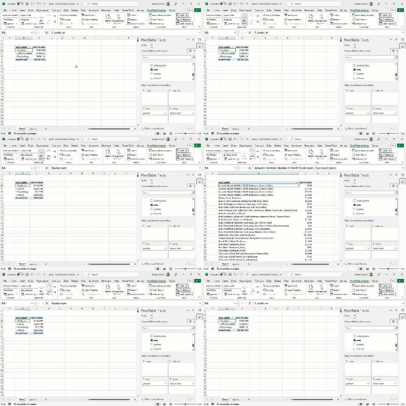
If you’re working with complex data in Excel Power Pivot, using hierarchies can make it much easier to analyze and understand your data. Hierarchies allow you to organize your data into meaningful groups and levels, providing you with a more comprehensive view of your data. This is particularly helpful when analyzing data with multiple levels of granularity, like the sales data in this demo:
When to use a hierarchy
Hierarchies exist all around us. For example, I am writing this blog post from Cleveland, Ohio, United States. We could create a hierarchy here starting with the broadest category, such as country, followed by the subcategory of state, and then another subcategory of city. From here, we would be able to to “drill up and down” in the data to analyze it at different levels of detail — moving from viewing population at the city to the state level, for example.
Creating a hierarchy in Power Pivot
To create a hierarchy in Power Pivot, select Diagram View and Ctrl-click the dimensions to include. For example, you can create a country, city, and state hierarchy. To complete, right-click and choose Create Hierarchy. I am going to name this hierarchy geography.
Let’s create one more hierarchy with category, sub_category, and product_name. Go ahead and name this one product. You should now have something like this in your Data Model:

You can always come back to Diagram View to add, modify or delete hierarchies from the Data Model. But for now, go ahead and load this data to a PivotTable to see it in action.
Using hierarchies in the PivotTable
Drilling up and down
Click the dropdown under orders in your PivotTable and you will see the geography and product hierarchies at the top of the list. Click on product and this hierarchy will automatically be moved to the Rows area of your PivotTable. Next, click on More Fields and place sales into Values:

Click on the cell that says Furniture in your PivotTable and head to the PivotTable Analyze tab of the ribbon. You should see an Active Field group with options to drill up and down on the data, among others.
If you’re clicked on Furniture, you will see the option to Drill Up is grayed out. Why? It’s because product is the top of the hierarchy — there is literally no place to go but down. Go ahead and click Drill Down and you’ll see that the PivotTable transforms to show only the sub-categories and products associated with the Furniture category.

Once you’ve finished drilling into the data, you can click Drill Up to return to the previous view.
Expanding and collapsing all fields
You may have noticed that when you drill into one category in the PivotTable, data from the others are removed from view. If you’d drill into the entire dataset, rather than just one category, try Expand Field from the Active Field group:

You can then select Collapse Field right underneath to drill up.
The highs and lows of Power Pivot hierarchies
While you may be ready to jump in and add hierarchies to your own data, keep in mind, however, that data quality inconsistencies can greatly affect their accuracy. For example, if one sub-category were inconsistently mapped to different categories, it would be difficult to make fair comparisons. Some less-experienced Excel users may also have difficulty getting started with them. All that said, hierarchies in Power Pivot are a great tool for aiding data analysis and interpretation among several levels of granularity
What questions do you have about hierarchies? Do you find this a useful feature, or would you rather keep your dimensions ungrouped? Let me know in the comments.
