Data profiling is used to examine a dataset to understand its structure and quality, identifying data types, inconsistencies, and outliers. This process ensures data accuracy and integrity, essential for informed decision-making. Excel’s Copilot can help automate data profiling, quickly finding dataset dimensions, exploring value distributions, and identifying outliers. It helps users efficiently prepare and understand their data for accurate insights.
To explore data profiling in Copilot, download the exercise file provided below. This file is a modified version of the well-known Palmer Penguins dataset.
Starting with the basics, one might ask Copilot about the total number of rows in the dataset:

If you verify this result against the source data, you will confirm that the figure, 333, smartly excludes the header row.
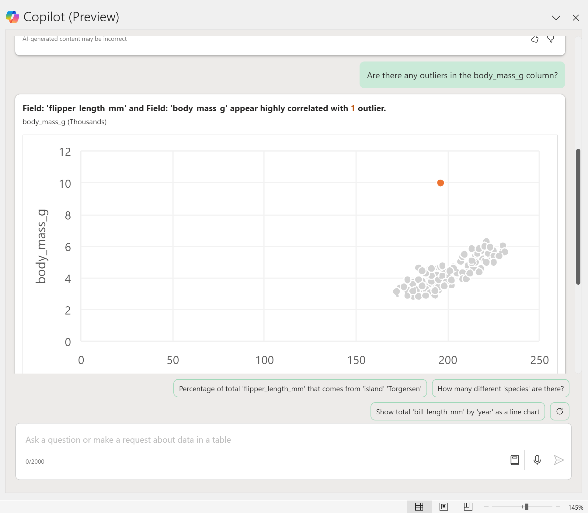
Next, I will examine the potential for outliers in the body_mass_g column. By prompting Copilot, a scatterplot is generated, indicating a notable anomaly, especially when compared to the flipper_length_mm column. Upon incorporating this scatterplot into my worksheet, it reveals a penguin with an unusually high weight of 10,000 grams—a figure intentionally exaggerated for demonstration purposes.

If you identify an outlier, it’s advisable to examine the suspicious data entry more closely, employing methods like sorting or filtering for a thorough investigation.
For the moment, let’s focus on understanding our categorical variables. Consider the column labeled island, for instance. I would like to verify the total number of islands represented in this dataset:

I’ll request Copilot to identify the unique values in the island column, and there they are. If I wish to delve deeper, I can ask Copilot for the distribution of the island column. This will provide me with a count of the records associated with each island:

Quantitative variables also benefit from this approach. When you request the distribution of body_mass_g, Copilot will generate a histogram, which can also be used to detect potential outliers in this column:

One aspect of the histogram generated by Copilot that I find annoying is the presence of spaces between the bars. Considering it is intended to represent a continuous variable, the gaps are unwarranted—it’s not a bar chart, after all.
However, fixing this in Excel is straightforward: just add the histogram into the workbook and modifying the gap width of the embedded chart.
For those adept at leveraging its capabilities, Copilot elevates Excel into a significantly more powerful and intuitive platform for data profiling. It enables users to uncover their data’s comprehensive story before moving into the cleaning and analysis phases.
Do you have any question about utilizing Copilot for data profiling and maximizing its potential for deriving business insights and efficiencies? Feel free to share your questions in the comments.
